Results: Fifteen Minute Drawings
Well, so the results of my fifteen minute drawings are in. I have to say I’m not as happy with them as I had hoped, but it was a somewhat ambitious goal: I’m still learning the GIMP image editing program, and I’m still working on my composition skills. I think that next time I might want to spend more time working on making good compositions and less time fighting with the GIMP.
Anyway, here are the results (click on the image to see the large version):
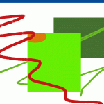
- 15 Minute Composition 1
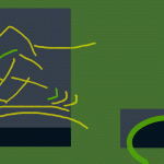
- 15 Minute Composition 2
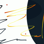
- 15 Minute Composition 3
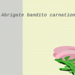
- 15 Minute Composition 4
So what do I like and dislike about each one? Here goes:
Composition 1
This ended up being my least favorite of the bunch. It’s hard to find things I like about this. It’s cluttered, the colors are all over the place, and there’s no consistent theme. There’s also no focal point. The orange cut-out on the middle green square is interesting, but the color is poorly chosen.
How could I improve this image? Well, for starters I would try to come up with some consistent theme to tie everything together, and create a focal point for the image. Throwing things off balance would help to break up the monotony a bit. Next, I would look at creating a consistent color pallet. Finally, the picture needs something to create depth. Either a background or a foreground layer might be nice.
Composition 2
This one’s a little better. There’s at least a reasonable color scheme going on (it’s still not my favorite, but I do like the two blue tones). I like the way that the doodles on the left fall out of the space created by the background block. The two contrasting sides of the picture don’t really do it for me, though. They are fighting for my attention. The left is clearly dominant, but the other doesn’t add anything, so it is just pulling my attention away.
I think I could improve this drawing by:
- Varying the brush strokes for the doodles. Different thicknesses, pens, and colors would go a long way.
- Working on the color pallet a bit. It’s got potential, but is a bit off.
- Get rid of the right side entirely and focus on the left. I think it’s got decent potential.
Composition 3
I’m not going to say a lot about this one. I was getting a bit bored and distracted by “Grey’s Anatomy” (what… it’s Dore’s show…). I’m always a sucker for blue and orange, what can I say. The squiggles are becoming a bit boring, aren’t they? I need a new gimmick. I liked using the speed-influences-color setting to add some flair to the stroke. That adds some dynamics. But it doesn’t save compositions, though.
I like the big background because it pulls you in, but otherwise this is pretty boring.
Composition 4
This is the only one of the bunch that I would actually call a composition. I really liked the background placement, even if it’s not the prettiest color. I liked the text as a compositional element. (Notice that it’s ABC’s. I actually have no idea where “abrogated” came from; I can’t recall ever seeing it before it just popped into my head. It turns out that it means, “to abolish, do away with, or annul, especially by authority.” [source] Who knew?) Once I got to “carnation” I just started doodling what looks almost, but not quite, entirely unlike a carnation. Oh well, I’ve never been much of a doodler.
If I were to make this better, I’d look at fixing up the colors and adding a few more elements to shore up the empty space. I’d also try to do something with the sorry excuse for a carnation. 🙂


I was instantly impressed with #1 and #3 and love the doodle on the left in #2. You have some Japanese influence there. They are bold, but peaceful somehow. The blue in #2 is a bit dull. #3 is my favorite. Not liking #4 AT ALL !!! (Hallmark came to mind and OLD LADIES) Where do you get all your creativity !!?? Have I told you how AMAZING you are lately!!?