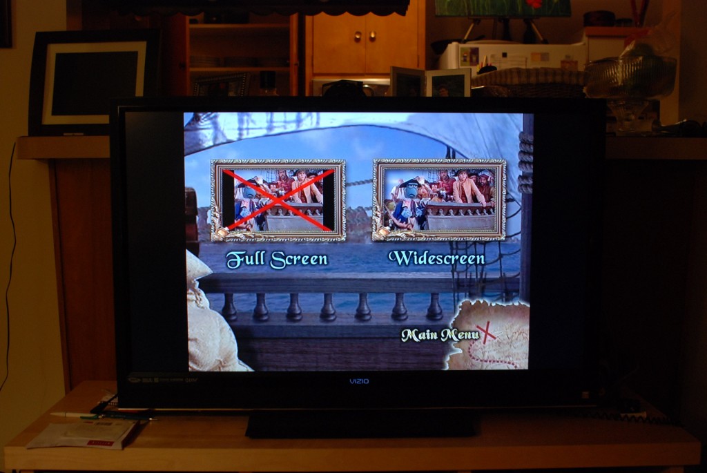
Who Designed This Menu?
It’s a fact of life that there are bad user interfaces out there. Â Let’s face it: designing something that is simple and intuitive is tough. Â But we put up with so-so or even downright bad interfaces because we just need to get things done. Â It’s not optimal, but whatever.
Then every so often you run into an interface that is so completely awful that you not only can’t get anything done, but it seems to actively do exactly the opposite of what you want. Â Tonight I encountered such a beast. Â I give you the menu from the DVD of Muppet Treasure Island that allows you to select between standard and widescreen versions:
Yes, the giant red X is in fact indicating my current selection. Â As in, if I hit enter at this point I’ll be watching the standard aspect ratio version of the film.
You read that right. Â The giant symbol for “not this one” actually was meant to be “‘X’ marks the spot”.
The best part? Once you select the (wrong) version you’re stuck with that choice until you physically remove the DVD from the player and start again from scratch. Â Oh well… what’s another five minutes of obligatory dire FBI warnings and previews for shows from a bygone decade…
Sigh. Â Sometimes I’m amazed that we, as a species, haven’t been overthrown by slightly-above-average goldfish.
On second thought, maybe we already have.
